Every year, they fly from Mexico to Canada and back.
They are also listed as an endangered species in Canada.
You guessed it, it's the monarch butterflies!
I've explored a dataset of over 700,000 monarch butterfly sightings collected by citizens across North America. What started as curiosity turned into a full analysis of migration corridors, phenology, and understanding the limits of what volunteer-submitted data can tell us. This is what I found.
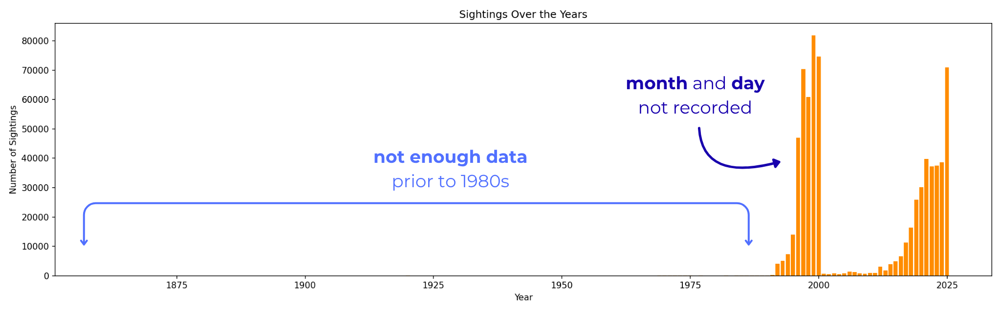
After removing records with unrecoverable dates, missing coordinates, duplicates, and pre-1980 observations, the dataset was reduced to 316,273 records. Given sparse coverage in the early years, the analysis was further restricted to 2010 onwards, yielding a final dataset of 312,235 records, roughly 44% of the original.
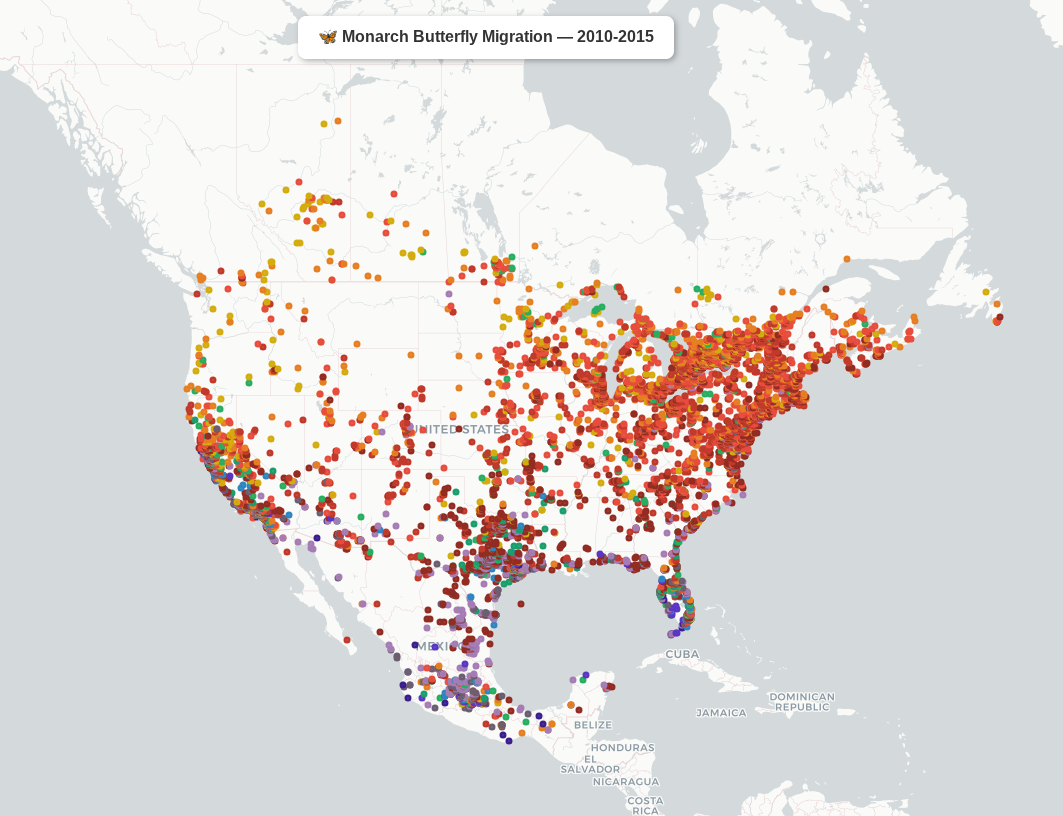
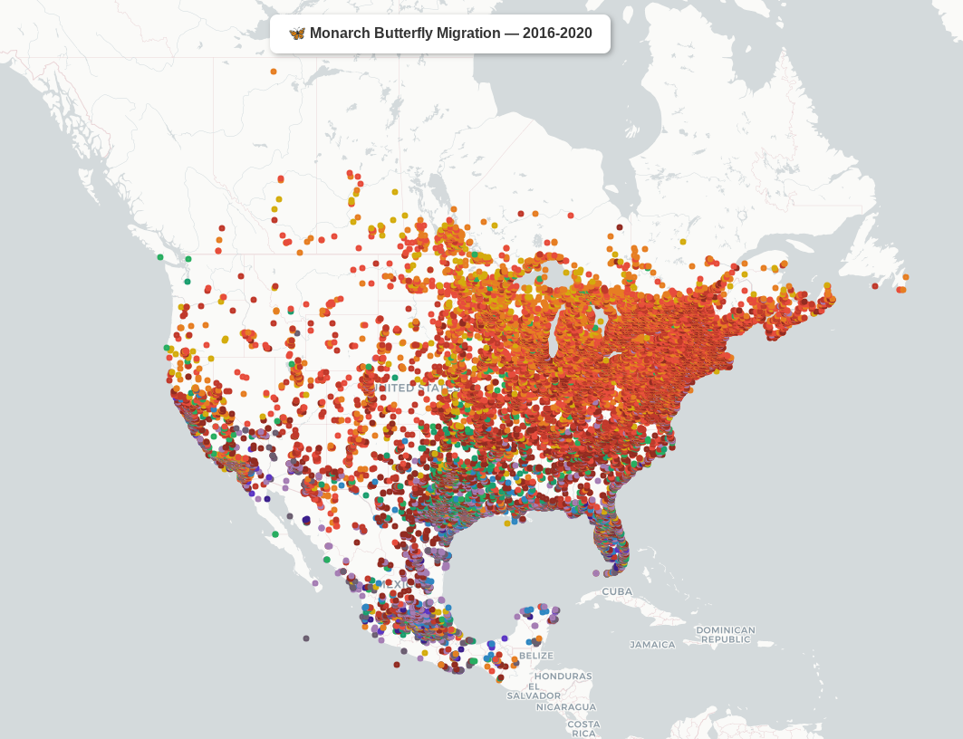
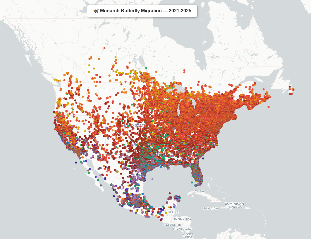
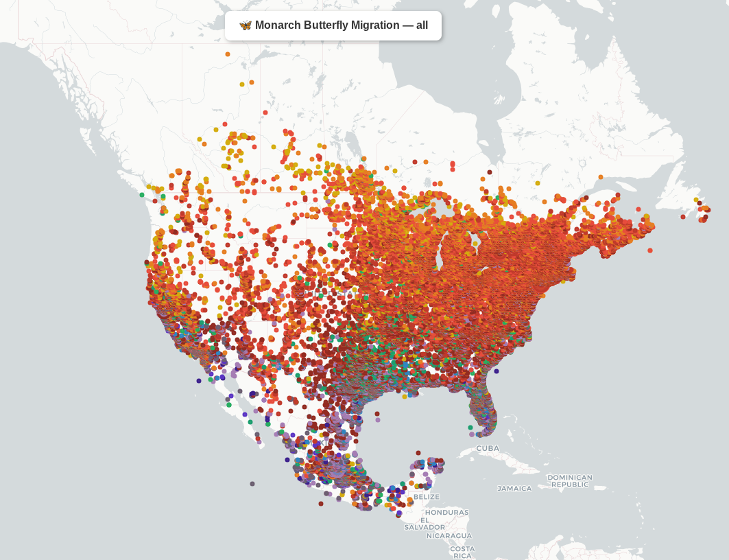
Each dot represents a sighting, colored by month of observation. Colors follow the seasonal cycle, with cool purples and blues in winter, greens in spring, warm oranges and reds through summer and early fall.
The animation below shows the monthly migration pattern across the full dataset. Watch the monarchs move north through spring and return south in the fall.
The table below shows the number of sightings per state per year. The participation bias is immediately visible: records in every state jump dramatically after 2017, reflecting an increase in citizen submissions rather than monarch population changes.
| State | 2010 | 2011 | 2012 | 2013 | 2014 | 2015 | 2016 | 2017 | 2018 | 2019 | 2020 | 2021 | 2022 | 2023 | 2024 | 2025 |
|---|---|---|---|---|---|---|---|---|---|---|---|---|---|---|---|---|
| Connecticut | 3 | 7 | 6 | 1 | 21 | 7 | 43 | 75 | 92 | 225 | 220 | 362 | 338 | 213 | 325 | 493 |
| Delaware | 1 | 0 | 2 | 2 | 8 | 14 | 15 | 31 | 39 | 42 | 106 | 141 | 134 | 149 | 151 | 289 |
| Georgia | 8 | 27 | 17 | 13 | 25 | 5 | 17 | 43 | 59 | 126 | 199 | 253 | 387 | 286 | 236 | 633 |
| Maine | 4 | 1 | 35 | 18 | 36 | 10 | 48 | 151 | 112 | 352 | 202 | 347 | 506 | 208 | 484 | 714 |
| Maryland | 7 | 8 | 13 | 16 | 62 | 64 | 151 | 233 | 344 | 557 | 817 | 847 | 1034 | 571 | 627 | 1753 |
| Massachusetts | 2 | 9 | 25 | 18 | 50 | 54 | 70 | 198 | 300 | 760 | 529 | 928 | 915 | 667 | 937 | 1117 |
| New Jersey | 22 | 17 | 29 | 15 | 33 | 45 | 81 | 196 | 263 | 495 | 465 | 688 | 459 | 382 | 747 | 1526 |
| New York | 39 | 34 | 29 | 16 | 38 | 44 | 85 | 502 | 631 | 1378 | 1233 | 1649 | 1242 | 969 | 1336 | 2246 |
| North Carolina | 8 | 4 | 11 | 10 | 23 | 82 | 66 | 121 | 253 | 370 | 602 | 631 | 642 | 676 | 705 | 1683 |
| Rhode Island | 1 | 0 | 3 | 12 | 9 | 9 | 21 | 37 | 36 | 66 | 53 | 82 | 88 | 78 | 116 | 137 |
| South Carolina | 9 | 19 | 12 | 5 | 21 | 28 | 53 | 104 | 104 | 150 | 227 | 231 | 189 | 200 | 195 | 418 |
| Virginia | 15 | 13 | 40 | 13 | 41 | 62 | 126 | 220 | 409 | 585 | 1223 | 987 | 997 | 732 | 761 | 2074 |
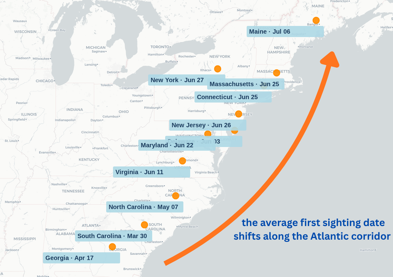
Despite the uneven coverage, a clear pattern emerges when we look at arrival dates. For each state, I calculated the 5th percentile sighting date across years with at least 100 records, effectively when monarchs first consistently show up. Only years with at least 5 valid years of data were included.
The results tell a clean story. South Carolina sees its first consistent sightings around March 30, Georgia around April 17, and the signal moves steadily northward through Virginia in June, reaching Maine by early July. The map below visualizes this progression along the corridor. This is the spring northward migration captured in citizen science data. While not perfect, it is remarkably coherent given the limitations of the dataset.
This analysis establishes a baseline and a framework, and rerunning it in 2030 with nearly two decades of consistent citizen-driven data will be a much stronger test of whether monarch arrival timing is responding to climate change.
| State | Slope (days/decade) | P-Value |
|---|---|---|
| Virginia | -51.41 | 0.1477 |
| Maryland | -32.24 | 0.2200 |
| Georgia | -28.97 | 0.5203 |
| North Carolina | -26.74 | 0.3758 |
| New York | -22.52 | 0.2861 |
| New Jersey | -20.95 | 0.2122 |
| Connecticut | -4.17 | 0.8957 |
| Delaware | -3.73 | 0.9614 |
| Massachusetts | 0.43 | 0.9847 |
| Maine | 14.01 | 0.5101 |
| South Carolina | 72.98 | 0.2187 |
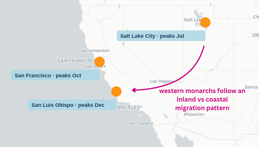
This population has suffered a catastrophic decline. The western overwintering population has dropped more than 95% since the 1980s, making it at greater risk of extinction than the eastern population, and a subject that warrants a dedicated analysis of its own.
The western population tells a different story, following an inland-coastal pattern rather than a north-south one, with inland breeding in summer and coastal overwintering.
Where the data falls short is in detecting change over time. The trend analysis, even after accounting for growth in citizen science participation, was inconclusive. With at most 10 years of reliable data per state, the signal-to-noise ratio is simply too low to draw confident conclusions about whether monarch arrival timing is shifting.
- Incorporate climate covariates such as spring temperature anomalies to separate biological signal from sampling noise
- Extend the analysis as data matures: by 2030 there will be nearly 20 years of consistent coverage which should make trend detection more reliable
- Conduct a dedicated analysis of the western overwintering population, whose 95% decline since the 1980s warrants closer examination
The analyses in this post are only possible because thousands of volunteers take the time to record and submit their sightings. If you spot a monarch butterfly, consider logging it on iNaturalist. Every observation counts and directly contributes to the scientific record.
If you are based in Canada, Mission Monarch is a citizen science program that tracks monarch and milkweed distribution across the country. In the US, Journey North has been tracking monarch migration since the 1990s and welcomes new observers.
You can also help by planting native milkweed and nectar plants in your garden, avoiding pesticide use, and supporting local conservation organizations working to protect monarch habitat.
Data Sources
Monarch Status & Conservation
Migration & Biology
- Monarch Joint Venture, Migration
- US Fish & Wildlife Service, Monarch Butterflies in California
- Western Monarch Trail
Citizen Science